Hello World Holidays is an airline booking app that I worked on while studying for my UX Design Professional Diploma with the UX Design Institute. During this project I worked on various research modules including competitive benchmarking, online surveys, note taking and user testing. The course followed on with three further modules, analysis, conceptualising and eventually, design. These modules covered journey mapping, affinity diagrams, flow diagrams, user interaction design and wireframing. As this study was an educational project, It wasn’t possible to show examples of everything learned.
Problem Statement and Goals
For this case study the wider context stated that the client is a start-up airline and the goal is to create a fast, easy and intuitive experience based on a deep understanding of their target users. In terms of the task, I was to focus specifically on the booking process and how users search and select flights online. Working through the full process would help inform the basic process of future projects.
The Target Audience
In general the application was aimed at anybody who books flights online, whether that be holiday makers, business travellers or those who travel for other reasons such as visiting family.
My Roles
Researcher
Analyst
User Test Moderator
UI Designer.
Research Strategy
The vision for this App was a fast and intuitive experience for all users no matter how complex the task they need to complete.
Considering a set of user goals the flow had to be seamless, delivering solid feedback when necessary.
Secondly, visual design had to compliment the flow and ensure that users know what to do at a glance.
The plan was as follows:
Benchmark competitor products
Conduct online surveys to learn more about users and what they are trying to do.
Oversee user testing to learn about the goals, context and behaviours of users. Also, to pin point the most common pain points.
Collate findings through graphs, charts, journey mapping and affinity diagramming to identify priority areas for improve.
Conclusions and Learning Outcomes
Learning about UX Design while working on this project has definitely helped me understand how complex the design of some applications actually is.
One aspect of designing systems for people is how important visual design is. How the visual design affects the flow can be damaging to the user process if not done properly, even if the flow is of an excellent standard.
The design process is something I would definitely look to change in certain areas on future projects. Here I skipped the sketch process which I now believe to have been costly to the final product. In this project I believe I jumped in feet first and as a result I missed some important visual design basics relating to user control.
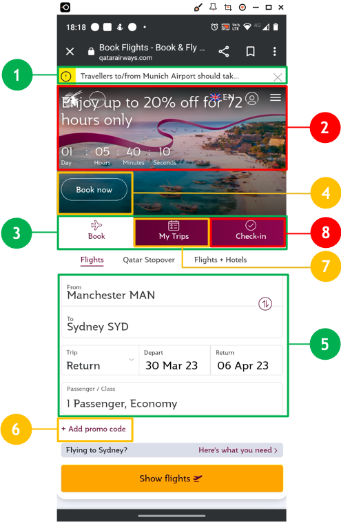
Competitive Benchmarking
Who Did I benchmark
Qatar Airways (World Leader)
United Airlines (Large operator with domestic origin)
Jet2 (Budget)
Trivago, (Company offering similar services via means of comparison)
What did I Measure?
I looked at a several UX factors. Usability, how an application flowed within a single task and also from one task to another. By measuring the feature set I could also uncover how they impact usability. I also looked at application performance in terms of how the app responds to users, and how the user responds with regard to confidence in the product.
What Did I Discover
In this case the task of booking a flight was very straight forward with the budget apps. No frills, no unnecessary features and an almost child-like interface. A flight could be booked in minutes for those users looking for quick results. However, with applications offering more services we see more features. Initially usability is good, to a point, but when the task becomes more complex I found a mix of feedback and performance issues. Some apps encountered visual problems although these didn’t necessarily impact on usage.
How Did My Findings Inform My Design
I tried to keep the overall design sleek but simple so as to fit with most user groups. For example, improving icon elements that indicate how you will complete a part of the journey by making them more visibly accessible was important. Making sure that ‘what’s included’ is always explained with ‘added extra’s’. This tells a user what their product already incudes and helps them make informed decisions about extra products and costs, improving trust in the seller and confidence in the product. Good feedback was just as important so I included a full product summary at the end of the process before proceeding to payment.
Online Surveys
Purpose of The Online Survey
The objectives of the survey was to learn about the goals of those who use these kind of websites. Is anything preventing them from achieving their goal, what other features they would like to see and what emotions this invoked. Online surveys were included in the research because they add a rich amount of data to the overall results.
Target Audience
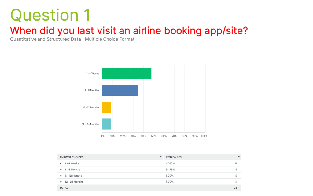
The survey targeted those users who had used an airline website very recently, at least within the last four weeks. This gave up-to-date information about real life issues that users are experiencing with modern software right now.
Survey Structure
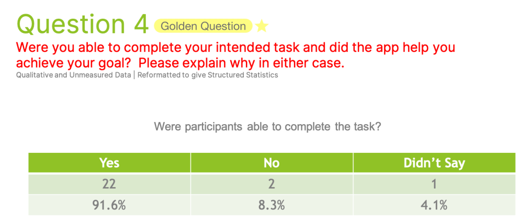
I had a bank of five questions including two quantitive and three qualitative questions. The three qualitative questions posed what are known as golden questions. I converted qualitative responses into quantitative data and displayed this in various chart types. The survey was distributed via Survey Monkey.
Key Insights
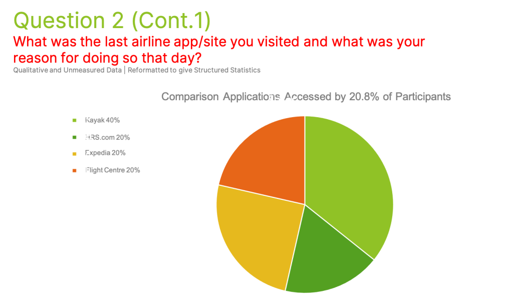
79.2% of respondents visited an airline app directly opposed to 20.8% who visited comparison sites.
Most common reason for using apps was to check prices rather than make bookings.
Of the 25% of users who thought the app was not helpful, 33% cited a best in class service provider.
Usability Testing
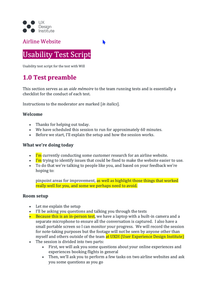
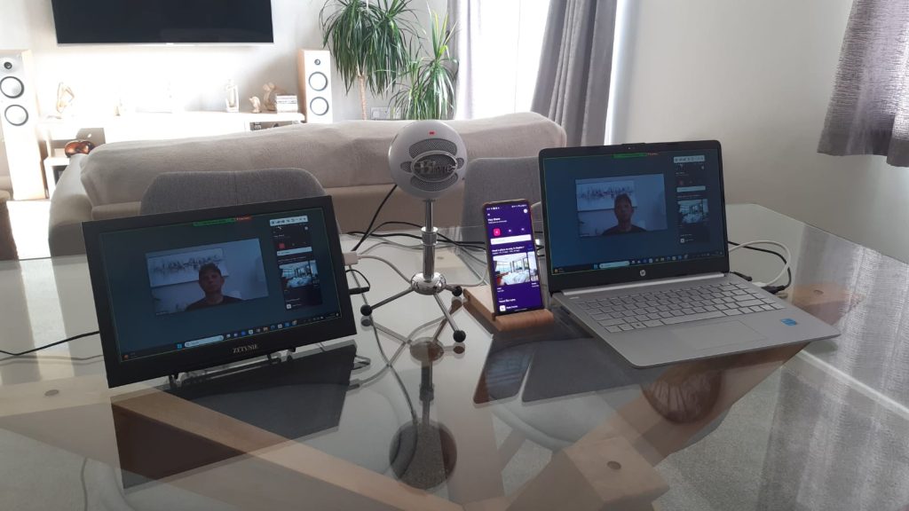
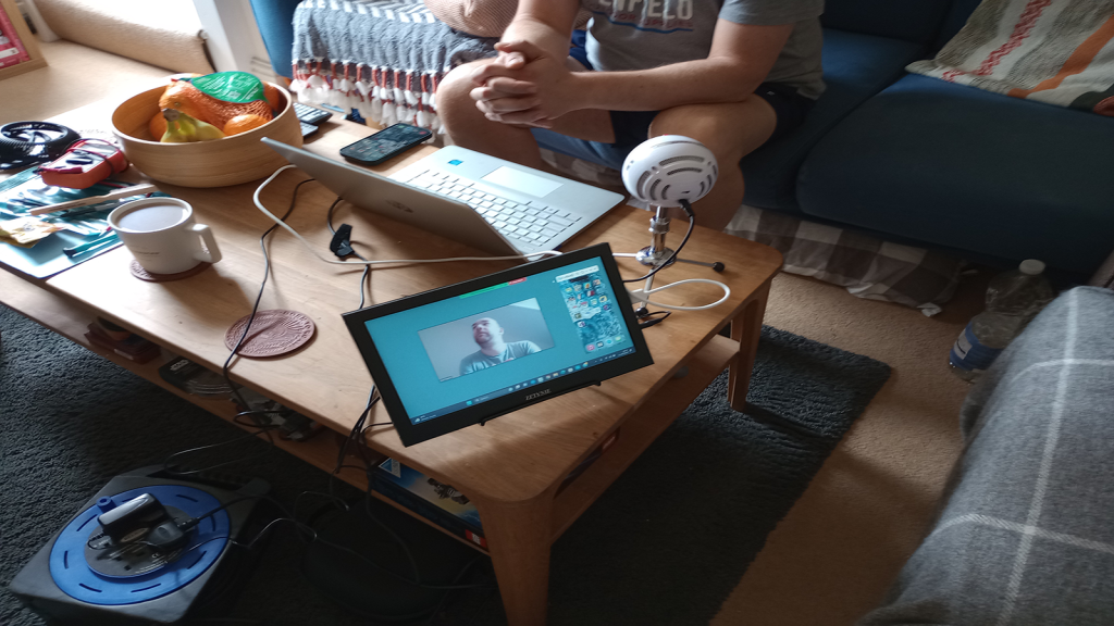
For this project I conducted an in-person usability test. The goals of the test were to observe how another user interacted with different software while conducting different tasks and try to identify any problems within the app that stopped the user from completed the given tasks. For this project one user who had recently used an airline application was sufficient.
Testing Methods
This usability test was conducted in person using Let’s View for screen mirroring and Zoom for recording and noite taking.
Applications Used
The applications I used in these tests were Qatar and Momondo, which is considered a travel aggregator.
Tasks Completed
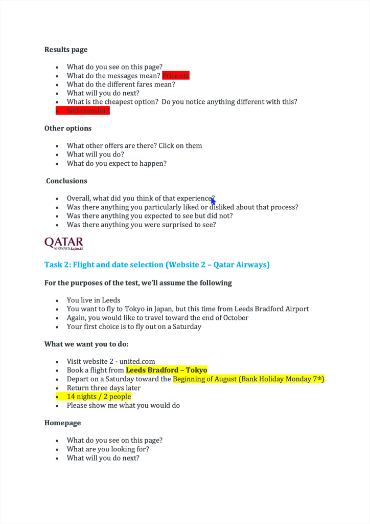
The participant was asked to complete several tasks using two different airline applications. The tasks comprised of booking one or multiple flight journey’s, navigating the apps features up to but not including payment.
Key Insights
The participant was asked to complete several tasks using two different airline applications. The tasks comprised of booking one or multiple flight journey’s, navigating the apps features up to, but not including payment. where added extras were available it was unclear what was already included. The user also struggled to remove chosen extra baggage. With the Qatar app there were several issues, with an overwhelming amount of information on the screen causing particular difficulty. The user eventually found it difficult to carry on with the process. A loss of the return leg of the journey went unexplained and wasn’t rectified until the user re-added that part of the journey. This app made heavy work of informing the user about things like technical stops and when clarity of feedback was needed it wasn’t there.
Adapting the test script.
Checking that the equipment and software work properly .
Beginning the test.
Usability Test Session
Note Taking
The Purpose of Notes in this Project
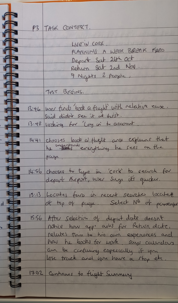
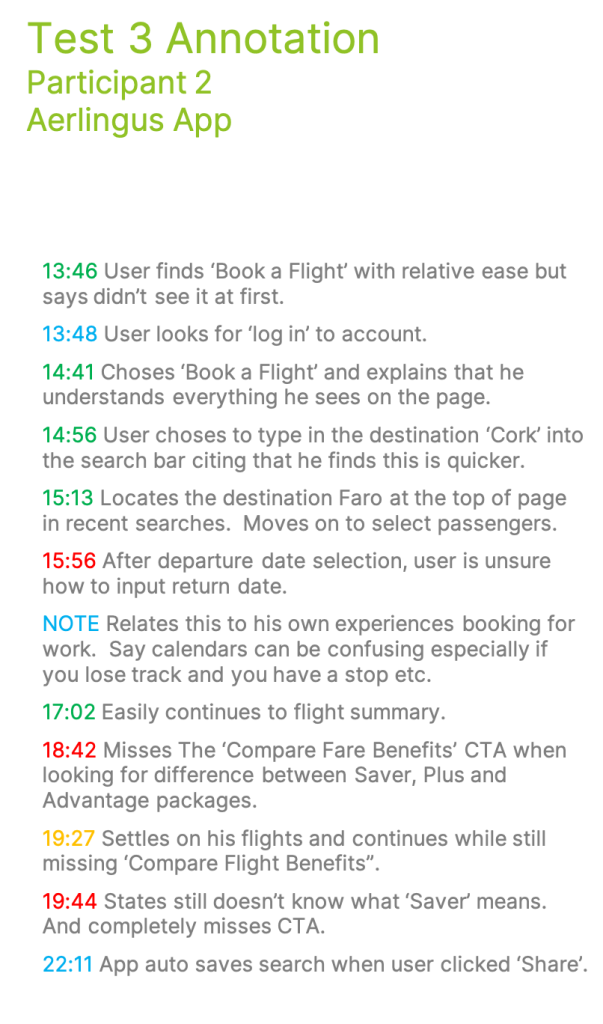
The objective here was to take notes that accurately captured the test session. My notes focused primarily on behavioural insights and recording verbal feedback.
Methods Organisation
The initial method I used was a traditional note book. I then generated a .pdf document from the written content. The strategy used was a simple traffic light system to highlight what works, what doesn’t and what I should mark for improvement. I also created a ‘blue note’ to run along side which was used to capture comments and conversations related to the test but not driven by the actual task.
Note Category
Empirical Observations – I documented how the user acted in general; Did the user hone in? Was anything blatantly missed eg. any CTAs. Facial expressions, what is making the user think?
Communication – There are two parts to this category A) Verbal feedback from the test, taking into account emotions and behaviours displayed by the user, and B) General comments and conversation that point to historical psychological barriers that impact the users ability to cope with the task. I added the blue note to try and capture these separately.
Patterns – I observed where users expected to see information that wasn’t there, missed or ignored helpful icons or links that would be useful in giving direction. With more complex tasks, users did state they would stop using the app and move to a different product.
Impactful Notes
Here are some examples of impactful notes I had taken during some of the tests. These notes and many more helped to inform my design.
‘User seems to be asking for confirmation for the next click before doing it’.
‘At the ‘chose seat’ option it becomes apparent that all flights have a stop over’.
Asking for confirmation during the test seems to reflect a confidence issue using software. Although there were options on screen this was not a difficult task to navigate.
In the second example the user becomes dismayed about stop overs not previously being fed back. Declares the app to be misleading and states would not book flights with this carrier. Eventually the user became aware that stopovers were highlighted and carries on as normal. There was also a theme with issues such as included and extra baggage.
Information Synthesis
After the research had been completed, I started the process of evaluating the information I had collated. To do this I used Affinity Diagrams and Journey Maps to help make sense of the data.
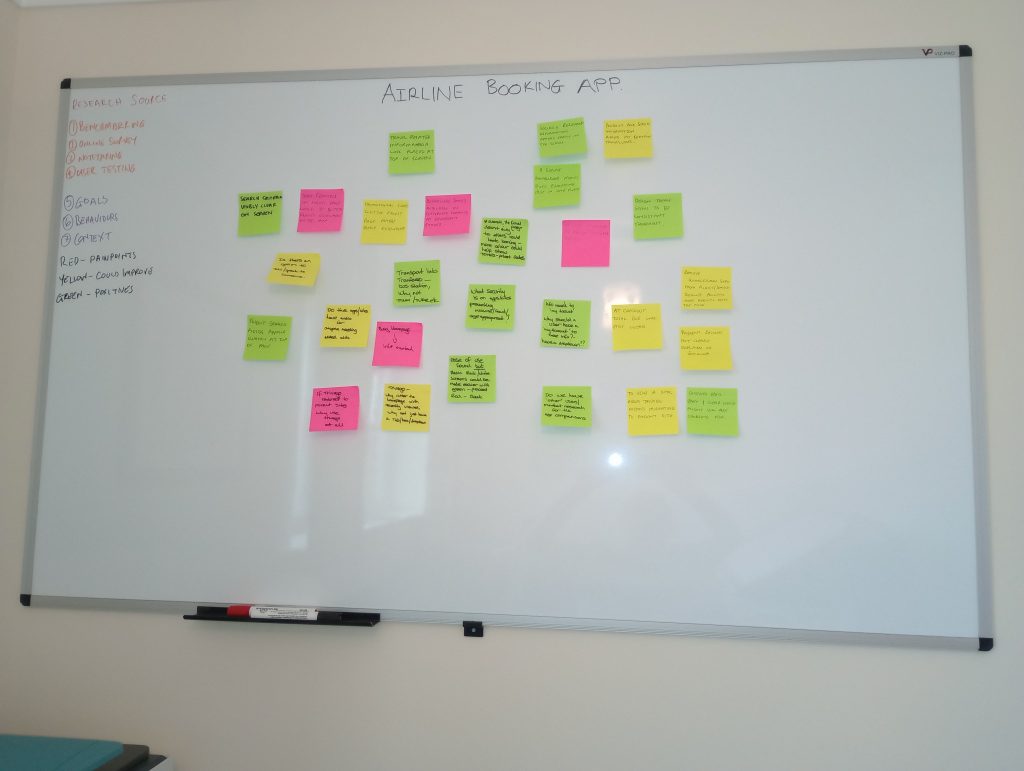
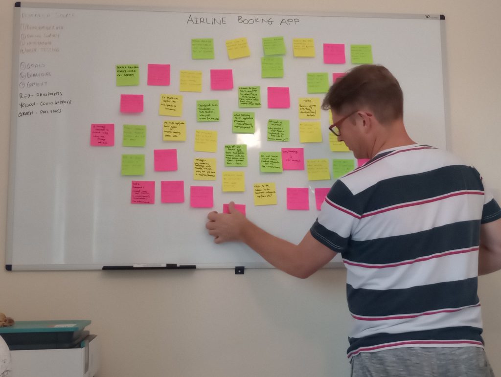
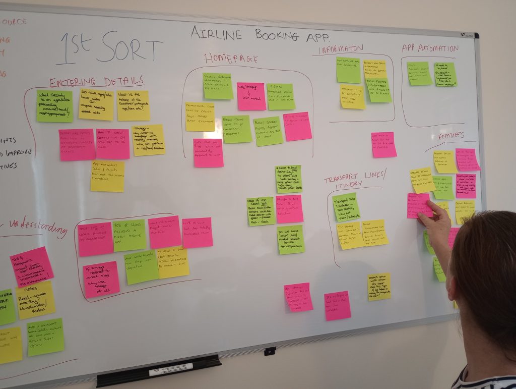
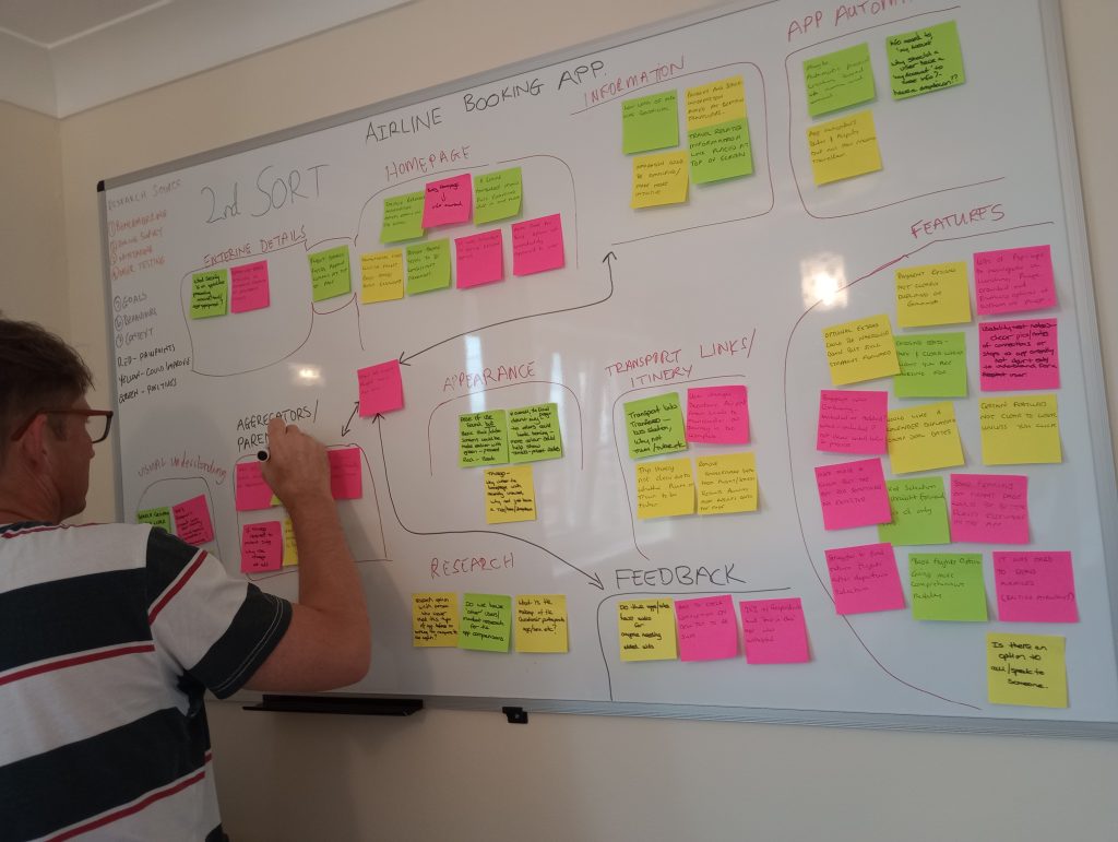
Affinity Diagram - Sorting Process
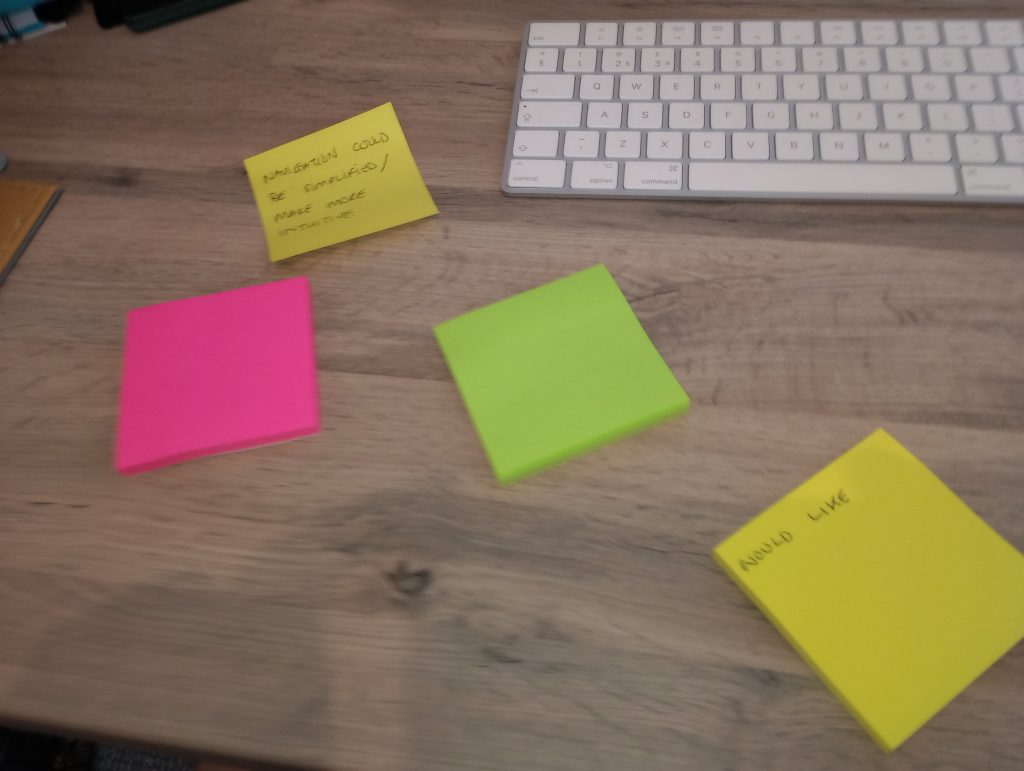
With the help of my partner we put together sticky notes based on based on the user research I had completed. Using coloured notes we created another traffic light system mimicking the must nots, the could improves and the emulates and grouped them relating to different parts of the app. So, for each section we had a range of goals, pain points, behaviours and emotions related to the research.
Emerging Categories
After the second sort, it emerged that the primary categories where pain points were most common was with features, closely followed by the home page appearance. Pop-ups and general information crowded out the home page, input areas for return flights were not clearly visible and the app doesn’t make it easy to redeem air miles.
Identifying the problems.
Collating the data.
Grouping the data.
Refining the groups
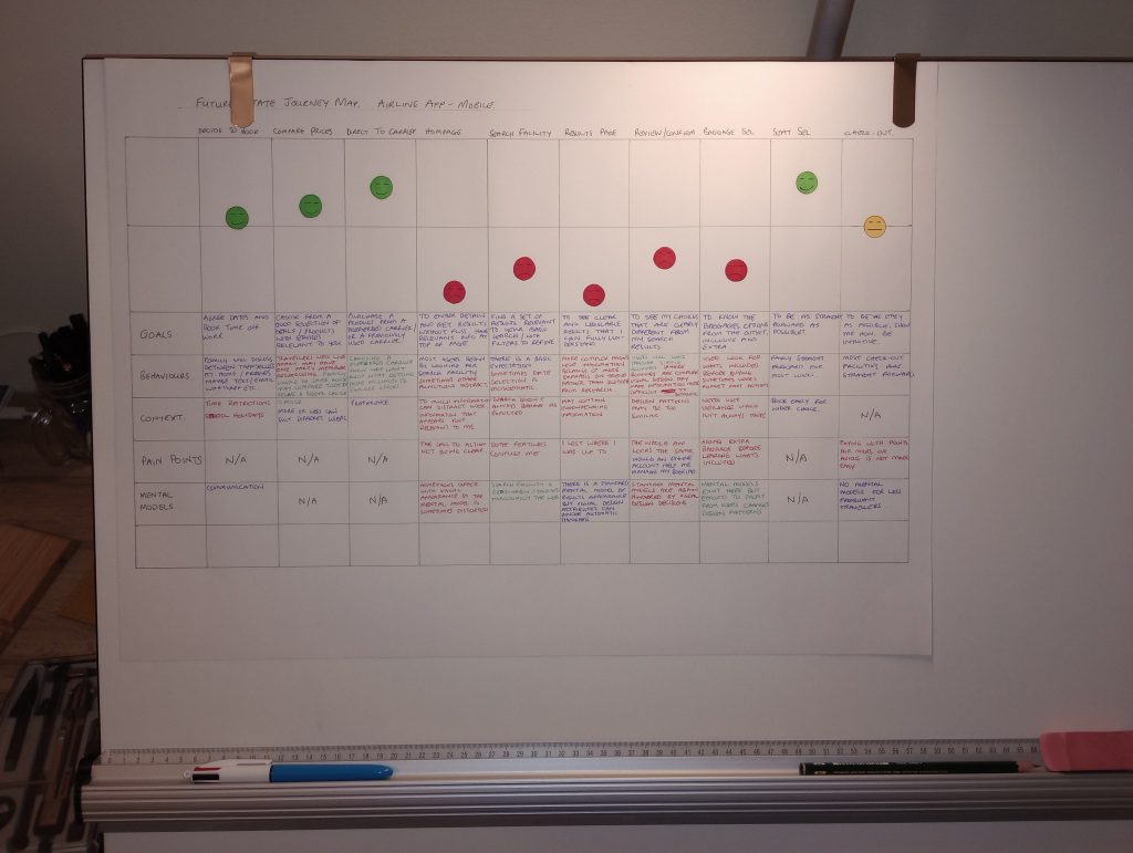
Journey Mapping
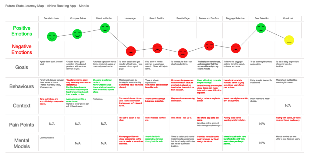
Creating the journey map was essential in helping me to understand the general emotion of the user, even if I found a small pain point in a stage of the process that was largely positive.
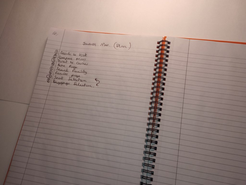
Stages of the Journey
There were ten stages of the journey in this project.
Decide to Book
Compare Prices
Direct to Carrier
Homepage
Search Facility
Results Page
Review and Confirm
Baggage Selection
Seat Selection
Check Out
Findings and Insights
Conversation seems to show that high emotions are what the user seems to be experiencing during the earlier touchpoints. During the later touchpoints, which is where my tests started from, the user expectation seems to be more negatively affected when interaction with the app begins. It starts high, but quickly depletes. More thinking is now taking place, the user is less confident but as the process moves along there is more awareness and consideration when interacting. Also as the process moves, the insight from the users behaviour is showing why emotions are higher at the beginning.
How Synthesis Informed the Design
From benchmarking, online surveys and user testing, it was imperative that the design should be as seamless as possible. Where possible, only necessary information should be visible. Products in the basic package should be comparable to the extra’s. Design should enable automatic thinking. A clear journey structure in terms of general feedback would help the user complete the task from search to payment quickly and more efficiently, leaving a positive experience to look back on. Making sure the home page was clean with clear CTAs. Ensuring every click did what the user expected and placing lesser important information in the off OCM. Had the project included the payment area it would have been very clear how to redeem Air Miles.
Considering the journey according to our research.
Strengthen the case for core issues with empathy mapping.
Getting to grips with the wider context of the journey landscape.
Lastly, almost there seeing the bigger picture of what the user is experiencing.
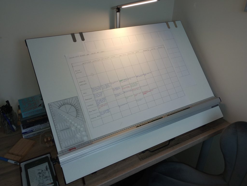
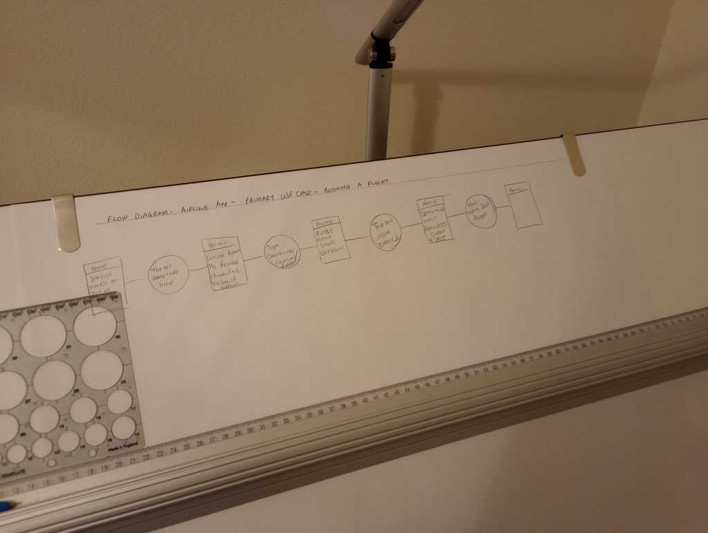
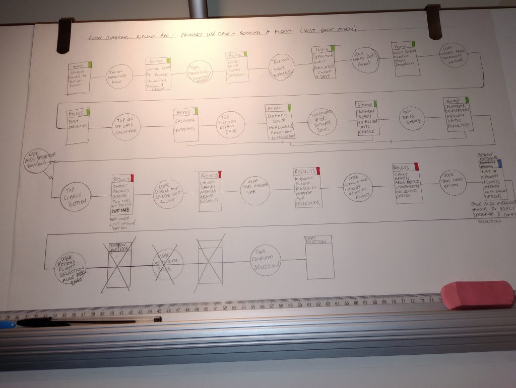
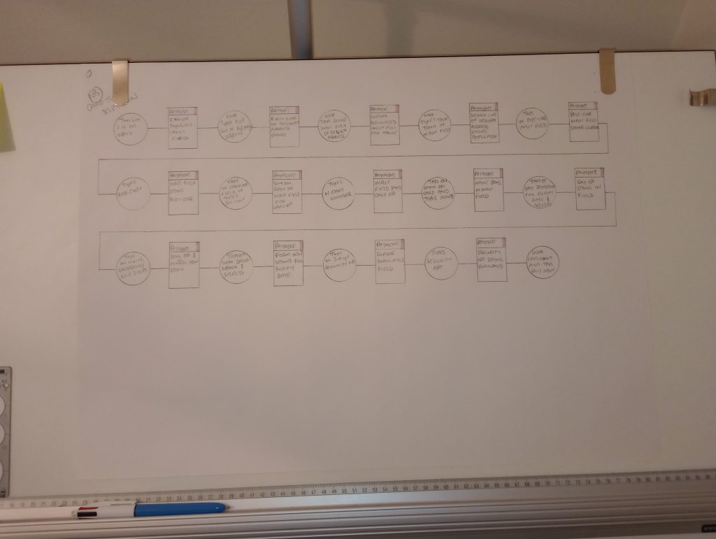
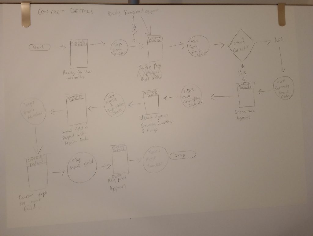
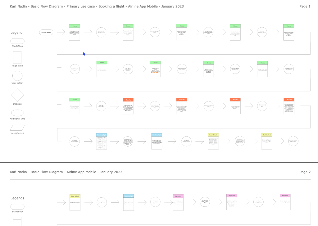
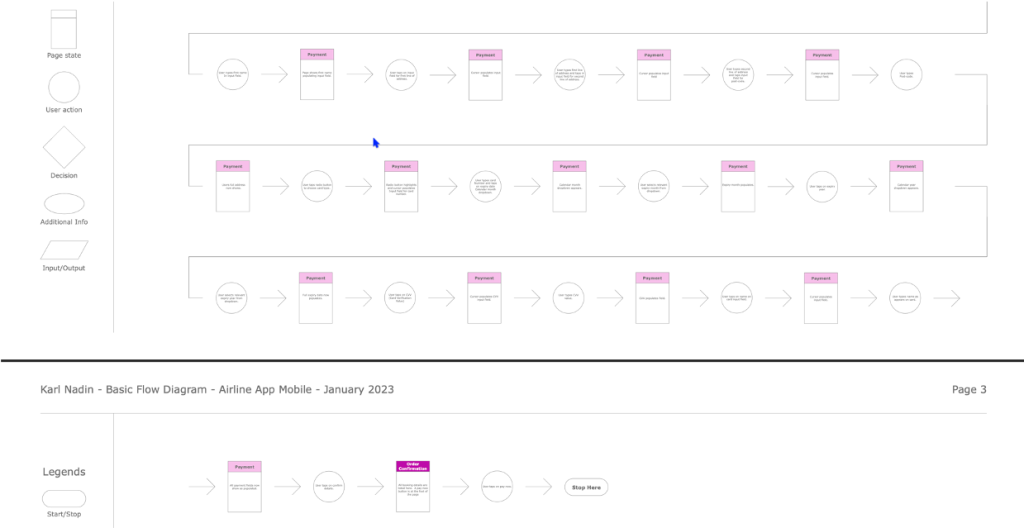
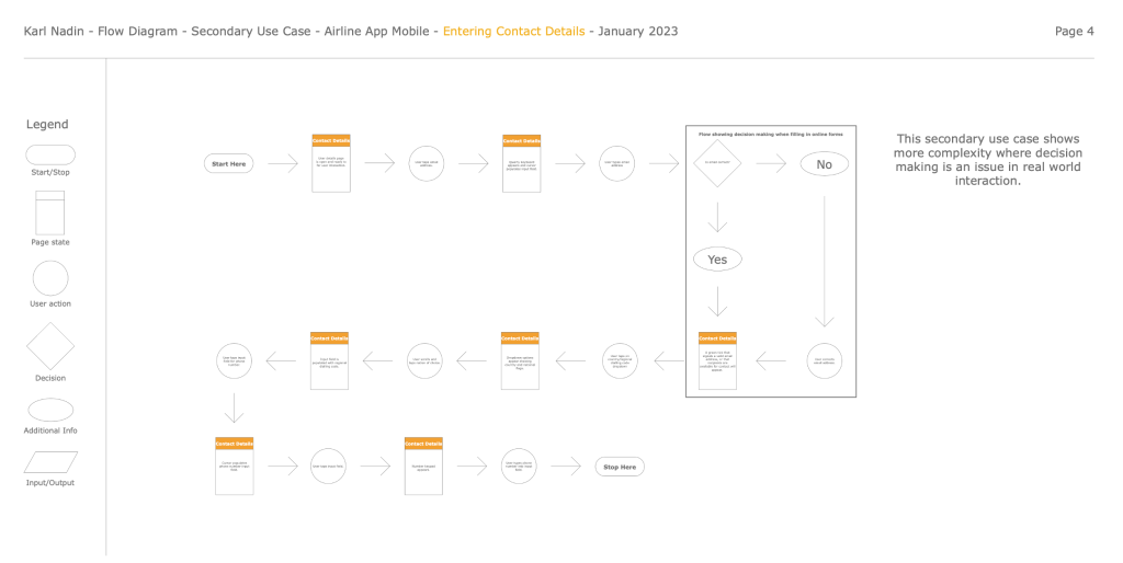
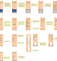
Flow Diagrams
Purpose and Scope
Creating a flow diagram helped me to visualise how a user will navigate through each screen and the different states which may occur. It also helped my understanding of more complex interactions and how screen states change depending on the inputted data.
The diagram covered about 85% of navigable sections in the app. These were the homepage, search facility, results page, review and confirm, and baggage & seat selections. Considering guided walkthroughs for onboarding and the checkout process were not part of the scope for this project.
Structure
The structure was basic for this flow. However, I was able to mimic the entry and exit points of the user journey, where conditional loops occur during error handling and understand how that logic impacts user flow.
Pains and Gains
The structure was basic for this flow. However, I was able to mimic the entry and exit points of the user journey, where conditional loops occur during error handling and understand how that logic impacts user flow.
Getting started with UI.
Understanding when mistakes happen.
Finalising the flow.
Moving on to other screens.
Designing for a primary use case.
Learning about the legend and its icons and designing for decision making.
Interaction Design
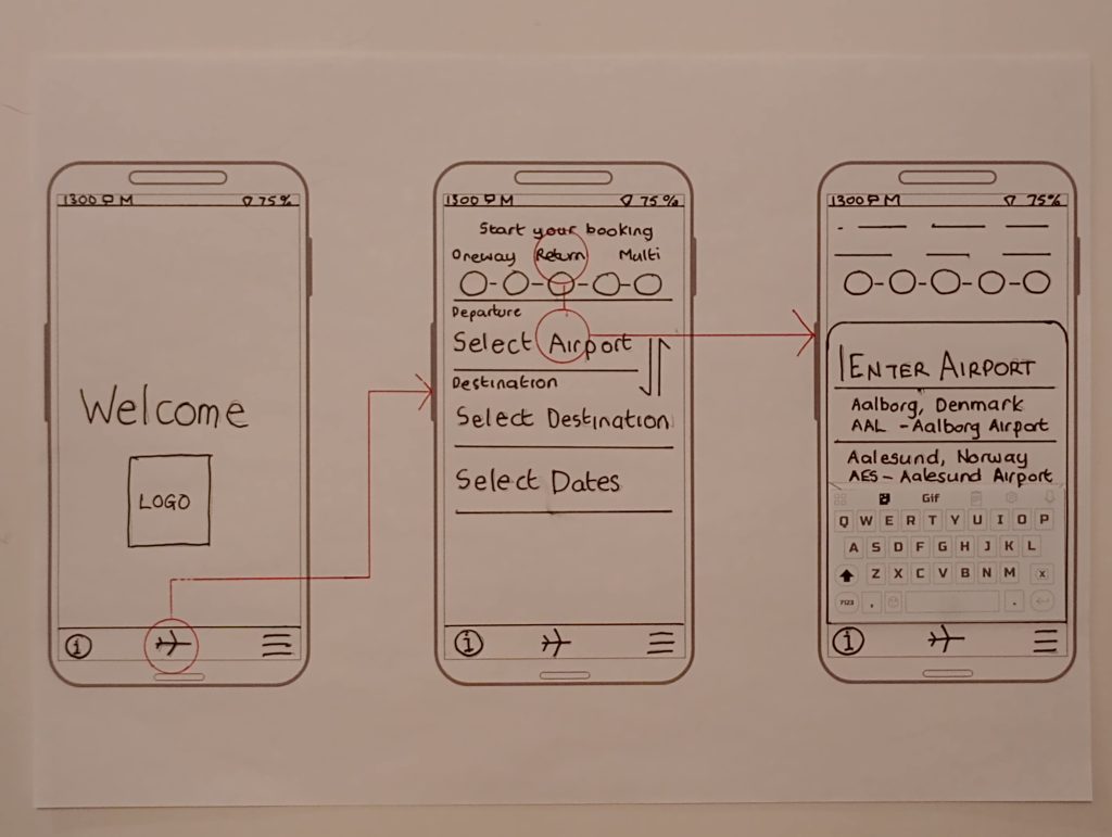
Sketching & Wireframing
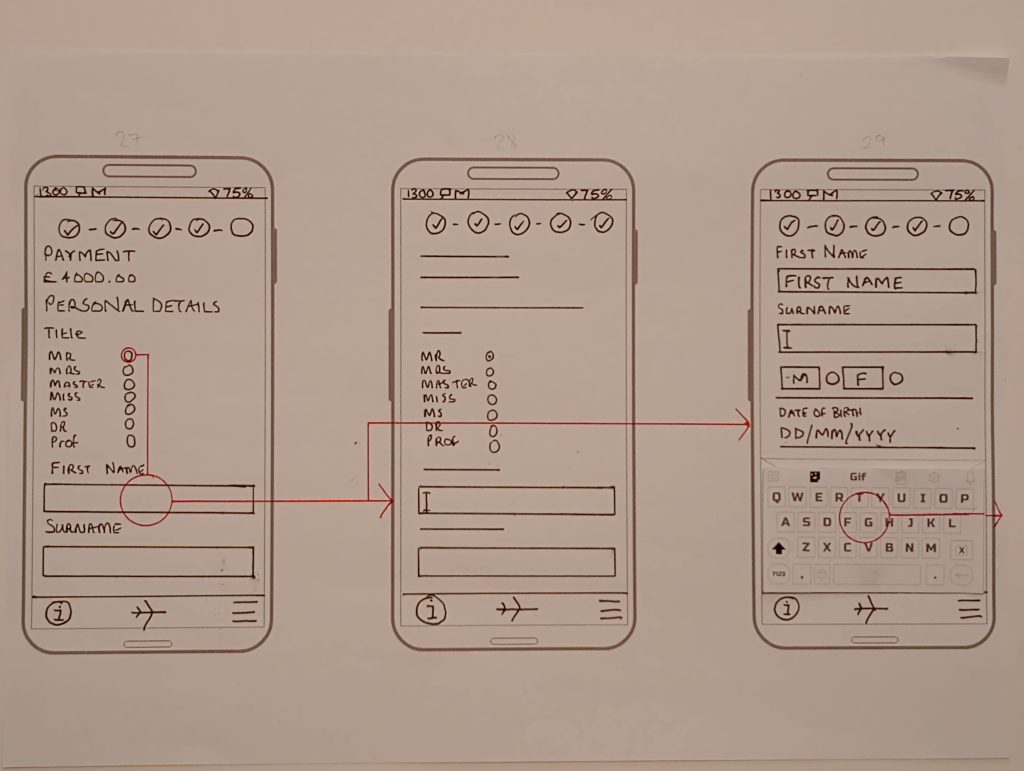
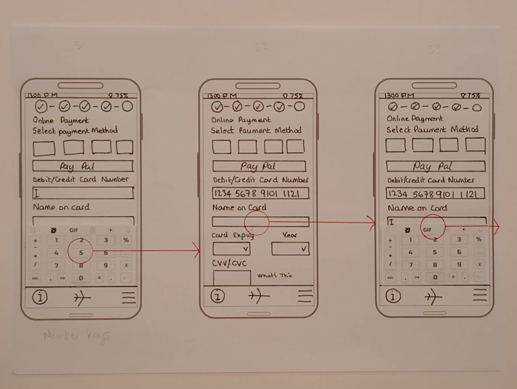
I started creating low-fidelity wireframes focusing on input fields being identified with text alone rather than a rectangular box. Hopefully this would create a cleaner sleeker interface. I did wireframe the payment page/states, which did use boxes for input fields although this was largely intended to emulate familiarity and the perception of security that users know and expect.
To try and minimise cognitive load I tried to represent a fuzzy match for the output of search criteria as it was entered. These decisions worked well to begin with, however, I was not consistent throughout which meant initial ideas got lost and the production of a more tidy wireframe took much longer.
Research, Testing and Feedback
I found through research and usability testing that some apps displayed too many options from the get-go and some users found this overwhelming. So, improving user engagement with seamless interactions was something this design aimed for. In turn, this would also improve task completion rates. Introducing review pages after every section aimed to reassure users that their choices had be recognised and nothing was missed out.
Prototyping
I produced a high-fidelity prototype using Adobe XD. And for the low-fidelity stuff, a pen, paper and a ruler. I built all of the UI elements myself, either using XD or Illustrator and used Photoshop for resizing and so on.
Reflections
After the synthesis process is complete, there is huge amount of ideas swirling around in your head, especially as a beginner. On account of this, it seemed natural that I wanted to jump straight in and get those thoughts on paper and turned into a design. It’s easy to get carried away without a structured plan, a list of design intensions, initial sketches, the To-do list and so on. As a result, I found that some ideas got lost in the frenzy.
Key
Good organisation and planning is key to making this process easier…I did learn that Interaction Design is hugely time consuming without a solid plan. I would make sure my ideas are written down before I sketch a single line. And those sketches need to be done. Lastly, on future projects my designs will most definitely employ a UI kit.
Starting the the selection process, choosing your trip type Departure and destination airports with dates.
A small design error with the ‘Who’s Travelling CTA. Here, the App fails to guide the user to ‘select’ travellers.
Showing additional travellers added to ‘Your Choices’ and the booking progresses.
Deliverables
Click the links below to see the online prototype and the annotated screen designs. Both assets have been created using Adobe XD.
This website uses cookies to improve your experience. We'll assume you're ok with this, but you can opt-out if you wish. Cookie settingsACCEPT
Privacy & Cookies Policy
Privacy Overview
This website uses cookies to improve your experience while you navigate through the website. Out of these cookies, the cookies that are categorized as necessary are stored on your browser as they are essential for the working of basic functionalities of the website. We also use third-party cookies that help us analyze and understand how you use this website. These cookies will be stored in your browser only with your consent. You also have the option to opt-out of these cookies. But opting out of some of these cookies may have an effect on your browsing experience.
Necessary cookies are absolutely essential for the website to function properly. This category only includes cookies that ensures basic functionalities and security features of the website. These cookies do not store any personal information.
Any cookies that may not be particularly necessary for the website to function and is used specifically to collect user personal data via analytics, ads, other embedded contents are termed as non-necessary cookies. It is mandatory to procure user consent prior to running these cookies on your website.